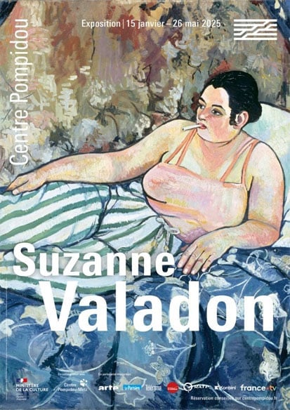
Thumbnail: poster for the exposition Suzanne Valadon at the Pompidou center. Source: https://expo.paris/exposition/suzanne-valadon-centre-pompidou-2025
Suzanne Valadon stands out from her peers thanks to her unique approach to her subjects. Painting in the early twentieth century, when cubism and abstract art are beginning to approach, Suzanne Valadon chooses to keep her focus on the material world: what we experience and those we experience it with. Her paintings, all marked by her singular style with bright colors and bold outlines, represent nature, her loved ones and her pets. This exposition brings painting and drawing together to highlight Suzanne Valadon’s truly unique artistic expression.
Suzanne Valadon, Route dans la forêt de Compiègne, 1914, Oil on canvas, Musée Fabre, Montpellier Méditerranée Métropole

I like this painting because of its bright, saturated green hues. The subject choice is interesting: we could have expected it to be the forest in the background, or the house which we only see the edge of, but Valadon chose to focus on the path. We see it, a light beige color, that cuts through two areas of bright green. The garden, with its orangey greens, can still be found mixing with the blueish greens of the forest on the right hand side. The fence, in turn, mimics the tree trunks of the forest. Nature, whether it be in a garden, or in a forest, is the same.
Suzanne Valadon, Chien endormi sur un coussin, vers 1923, Oil on cardboard mounted on panel, Fondation de soutien à l’Hermitage, Lausanne

This sleeping dog is thought to be one of Valadon’s dogs: l’Abri or la Misse. Valadon’s personal style can be seen in this work: striking contrasting colors, dark outlines and a visible brushwork. Although she uses two complementary colors, red and green, the painting isn’t overwhelming. This is thanks to the green shadow on the dog, along with the orange highlights on his fur, that tie the piece together. This way, the work looks coherent, making it a safe place for the little dog to have a rest.
Suzanne Valadon, Nature morte au poisson, 1926, Oil on canvas, Fondation de soutien à l’Hermitage, Lausanne

What first drew me to this work was the flatness of the piece. Due to the lack of perspective, all of the elements seem stacked on top of one another; it looks like a collage, which I like. The use of color is also striking once again, with a sharp contrast between the red tablecloth and the bright yellow lemon. The fish ties in these bold colors with its hues of yellowy-green and pink, making the piece look harmonious.
Information from: https://www.centrepompidou.fr/fr/programme/agenda/evenement/5moMjyy
Laisser un commentaire